What Is a Sticky Website? How to Keep Visitors Engaged

Engaging website design encouraging visitors to explore content and stay on the website longer.

By Adam

What Is a Sticky Website? How to Keep Visitors Engaged

What Is a Sticky Website?

Getting someone to visit your website is only half the battle. Once they arrive, you need to give them a reason to stay.

Think about the last website you visited and immediately closed. Maybe it loaded too slowly. Maybe you could not figure out where to click. Maybe the page was filled with text, pop-ups, and buttons competing for your attention. Whatever the reason, something about the experience made leaving easier than staying.

A sticky website does the opposite.

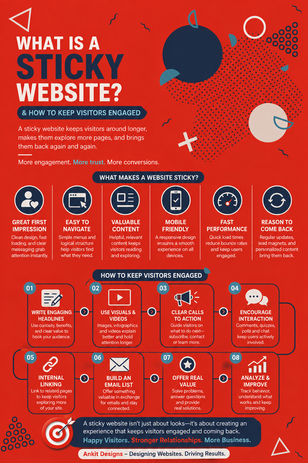
In web design and digital marketing, a sticky website is a website that keeps visitors engaged and encourages them to spend more time exploring its content, pages, products, or services. Instead of landing on one page and leaving, visitors have reasons to keep clicking, reading, watching, shopping, or interacting.

Website stickiness is not about trapping people on your site. It is about creating an experience useful and enjoyable enough that they want to stay.

At Ankit Designs, this is one of the reasons we believe good web design needs to go much deeper than appearance. A beautiful homepage is great, but a website becomes much more valuable when its design actively helps people understand your business, find what they need, and confidently take the next step.

Arrested Development scene - I've made a huge mistake.

Why Does Website Stickiness Matter?

Most businesses spend considerable effort trying to bring visitors to their website. They invest in SEO, Google Ads, social media, email marketing, referrals, and other channels to generate traffic.

If those visitors arrive and immediately leave, much of that effort goes to waste.

A sticky website gives the traffic you already have more opportunities to produce results. Someone who originally finds one blog post might explore your services. A visitor comparing products might look at several options instead of leaving after the first page. A potential client might read a case study, check your previous work, learn more about your company, and eventually submit a contact form.

The longer and more meaningfully someone interacts with your website, the more opportunities you have to demonstrate your value.

That does not mean every visitor needs to spend 20 minutes browsing. Sometimes a great website helps someone find an answer and convert within two minutes. The real goal is to reduce unnecessary exits and create a natural path toward whatever the visitor came to accomplish.

What Makes a Website Sticky?

There is no single feature that suddenly makes a website sticky.

It comes from combining good design, useful content, intuitive navigation, strong performance, and a clear understanding of what visitors actually want.

A website can look impressive and still fail to engage anyone if people cannot navigate it. Another can have excellent content but lose readers because the pages are difficult to scan. Even a well-designed site can struggle if it takes forever to load on a phone.

The strongest websites make these elements work together.

At Ankit Designs, our website design and development process begins by understanding the business, audience, user experience, and goals before jumping into the visual design. That planning matters because a sticky website is not created by adding random interactive features. It is created by understanding what keeps your customers moving through the site.

How to Make Your Website Sticky

If visitors regularly arrive on your website and leave without exploring further, you do not necessarily need more traffic. You may need to make better use of the traffic you already have.

Here are some of the most important ways to make your website stickier.

Make the First Few Seconds Count

Visitors should be able to quickly understand where they are and why they should care.

Your homepage does not need to explain every detail of the business above the fold, but it should give visitors enough information to know they are in the right place. Clear messaging, professional design, strong imagery, and an obvious visual hierarchy can immediately make a website feel more trustworthy and worth exploring.

Confusion creates exits. If visitors have to work to understand what you offer, they can simply return to Google and choose someone else.

That is why the strongest hero sections tend to be clear rather than clever for the sake of being clever. Tell people what you do, communicate why it matters, and then give them a logical place to go next.

Create Navigation That Feels Effortless

Good navigation often goes unnoticed, which is exactly the point.

Visitors should not have to think very hard about how to move through your website. Main services should be easy to find, menu labels should make sense, and important information should never feel buried three layers deep.

This becomes especially important for larger websites. As pages, services, blogs, products, and resources accumulate, navigation can become cluttered surprisingly quickly.

A thoughtful site structure gives people clear paths based on what they are interested in. Someone exploring one service should be able to easily discover related services, supporting information, case studies, or a relevant call to action.

The goal is to make the next click obvious without forcing it.

Give People Content Worth Staying For

You cannot design your way around weak content.

If every page says essentially the same thing, visitors will quickly run out of reasons to explore. Useful blogs, detailed service pages, case studies, videos, FAQs, guides, portfolios, and other resources give people additional ways to engage with your business.

The key is relevance.

A contractor might benefit from project galleries and service-area pages. A law firm may need detailed explanations of its practice areas. An ecommerce company needs useful product information and intuitive category pages. A professional service business could use case studies and educational content to demonstrate expertise.

This also gives internal linking much more value. Instead of reaching the end of a page with nowhere to go, visitors can naturally move toward related information.

Good content creates the reasons to stay. Good design makes those reasons easy to discover.

Make Your Pages Easy to Read

Even valuable information can feel exhausting when it is presented badly.

Large blocks of text, tiny fonts, weak contrast, inconsistent headings, and crowded layouts make visitors work harder than necessary. Online readers also tend to scan before deciding how deeply they want to read, so visual hierarchy matters.

Use meaningful headings, comfortable paragraph lengths, white space, images, lists where appropriate, and clear visual separation between topics. Important information should stand out without turning the entire page into a collection of giant callout boxes.

This is something we take seriously at Ankit Designs. User-friendly layouts are a core part of our web design process because content cannot do its job when the website makes consuming it frustrating.

A sticky website feels easy to explore.

Keep Your Website Fast

Few things kill website stickiness faster than a loading screen.

Visitors have become accustomed to fast websites, particularly on mobile devices. When every click creates another long wait, exploring the site starts to feel like work.

Large images, bloated themes, excessive plugins, poorly written code, outdated technology, and unnecessary scripts can all contribute to slower performance. That is why website speed should be considered during development rather than treated as a problem to fix after launch.

At Ankit Designs, we put a strong emphasis on clean development and performance because the parts of a website visitors cannot see can still have a major impact on their experience.

A website should not only give someone a reason to click another page. It should make that click feel instant.

Design for Mobile Visitors

A website is not sticky if it only works properly on a laptop.

Mobile visitors interact with websites differently. Their screen is smaller, navigation changes, buttons need enough space to tap, and long sections can feel significantly longer. Features that look impressive on a desktop can become frustrating if they have not been properly adapted for mobile.

Responsive design allows the website to adjust to the device rather than expecting users to deal with a desktop experience squeezed onto a phone.

Ankit Designs builds responsive websites and tests across devices because mobile usability is no longer an extra feature. It is part of building a website properly.

If visitors can comfortably browse several pages from their phone, you have removed another reason for them to leave.

Use Calls to Action Without Overdoing Them

A sticky website should always give visitors somewhere useful to go next.

That could mean reading another article, viewing a project, exploring a service, downloading a resource, signing up for a newsletter, requesting a quote, or contacting the business.

Calls to action help create that direction.

The mistake is treating every call to action like an emergency. If every section says BUY NOW, CALL TODAY, or BOOK A CONSULTATION, the website can start feeling pushy rather than helpful.

The strongest CTAs appear when they make sense within the user’s journey. Someone reading an educational article may be ready to explore a related service. Someone reviewing your work may be ready to discuss a project. Someone arriving from a highly targeted ad may be ready to convert immediately.

For campaigns built around one specific goal, a dedicated landing page can create an even more focused experience by removing distractions and directing visitors toward a clear action.

Good calls to action do not interrupt the experience. They continue it.

Build Trust Throughout the Website

People tend to explore websites when they trust the business behind them.

Professional design helps, but credibility can also come from testimonials, reviews, client logos, case studies, certifications, team information, awards, clear contact information, and examples of real work.

Instead of putting every trust signal on the homepage, spread them throughout the website where they are relevant. A testimonial beside a service can reinforce the claims being made on that page. A case study can demonstrate what working with the business actually produced. A portfolio lets people judge the work for themselves.

The more confidence visitors gain as they explore, the more likely they are to continue toward a meaningful action.

Infographic on the problem with hiring a web design agency

Do Interactive Features Make a Website Stickier?

They can, but only when they serve a purpose.

Calculators, quizzes, interactive maps, filters, videos, search tools, live chat, animations, and personalized features can all make a website more engaging. But adding interaction simply because it looks impressive can have the opposite effect.

A mortgage calculator on a financial website can provide genuine value. A searchable project map might make sense for a developer. Product filtering can dramatically improve a large ecommerce store.

A giant animation that takes five seconds to load and makes the navigation harder to use probably is not helping anyone.

Ankit Designs develops custom website functionality when the project actually calls for it. The goal should always be to improve the experience, not create complexity for the sake of showing off what the website can do.

Keep Improving After Launch

Website stickiness is not something you solve once and forget about.

Businesses change. Content becomes outdated. New pages are added. Plugins and software require updates. Customer behaviour evolves. A website that worked perfectly three years ago may slowly become slower, harder to navigate, or less relevant.

Review your analytics. Look at which pages people visit most often, where they tend to leave, which calls to action get used, and how visitors move through the site. Those patterns can help identify places where the experience can improve.

Maintenance matters too. Ankit Designs offers CareKit WordPress support to help businesses keep their websites updated, backed up, monitored, and functioning properly after launch.

A sticky website needs to stay healthy enough to keep providing a good experience.

A Sticky Website Gives People a Reason to Stay

So, what is a sticky website?

It is a website that makes people want to keep exploring.

It loads quickly, feels easy to navigate, presents useful information clearly, works properly on mobile, earns trust, and continually gives visitors a logical next step. Most importantly, it understands why people came to the website in the first place.

If you are wondering how to make your website sticky, the answer is not to fill it with more animations, pop-ups, or gimmicks. Start by making the experience genuinely better.

At Ankit Designs, we have been building websites around that philosophy since 2010. We combine strategy, custom design, responsive development, clean code, testing, and thoughtful user experience to create websites that do more than look good. We build sites people can actually use and businesses can confidently grow with.

If visitors are reaching your website but not sticking around, more traffic may not be the answer. It might be time to build a better place for that traffic to land.

Explore Ankit Designs’ website design and development services and see what it means to Build It Right.

Frequently Asked Questions

What does a sticky website mean?

A sticky website is a website that encourages visitors to stay longer, explore additional pages, interact with content, and potentially return in the future. Website stickiness usually comes from strong content, intuitive navigation, fast performance, good design, and an engaging user experience.

How do I make my website sticky?

To make your website sticky, focus on making it fast, easy to navigate, mobile-friendly, visually clear, and genuinely useful. Give visitors relevant content to explore and make sure every important page offers a logical next step.

Is website stickiness the same as a sticky header?

No. A sticky header is a navigation bar that remains visible while someone scrolls. A sticky website refers more broadly to a site that keeps users engaged and encourages them to continue interacting with it.

Does a sticky website improve conversions?

It can. When visitors explore more of your website, they have more opportunities to learn about your products or services, see evidence of your expertise, build trust, and reach a call to action. However, engagement should support the user’s goal rather than simply trying to keep someone on the website for as long as possible.

How can I tell if visitors are engaging with my website?

Website analytics can provide useful indicators such as pages viewed, engagement time, conversion actions, navigation paths, and exit pages. These metrics should be considered together rather than using one number alone to decide whether the website is performing well.

Ready to Find the Right Web Design Partner?

Your website should be a powerful tool that helps your business attract customers and grow with confidence. At Ankit Designs, we combine strategic thinking, creative design, and technical expertise to build websites that deliver real results.

Get in touch with our team today to schedule a consultation and discover how we can create a website tailored to your business goals.

Follow us on our social media pages below:

If you want to work with Ankit Designs for your web design Toronto, reach out to us!

About the author

I'm nobody's taxi service but I take pride in driving the bus! Upbeat, energetic serial entrepreneur on the quest to serve and help people. I enjoy long walks on short beaches and adventurous, adrenaline-pumping activities. I'm a normal bloke doing abnormal bloke things!
Read more posts by Adam
Phone Icon
Call Us
Contact Icon
Contact