Good Design Makes Content Easier to Read
Content marketing often involves taking complicated topics and making them easier for an audience to understand. Your website should help with that job, not make it harder.
Imagine opening an article and seeing 1,500 words packed into enormous blocks of text with tiny fonts and almost no spacing. Even if the information is excellent, most readers are going to feel like they have been assigned homework.
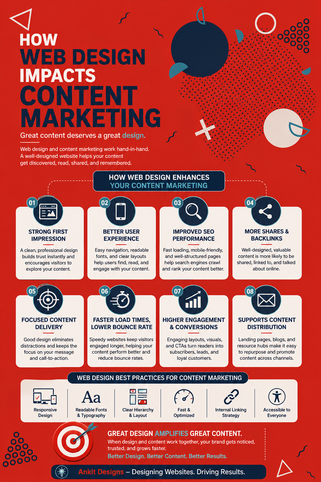
Effective web design creates hierarchy. Headings separate ideas, white space gives readers room to breathe, images break up longer sections, and typography makes the page easier to scan. Important information can be highlighted without turning every second sentence into a flashing callout.
This matters because people do not always read online content from beginning to end. They often scan headings, jump between sections, look for specific answers, and then decide whether they want to keep reading. When the layout supports that behaviour, your content becomes much easier to consume.
Design Helps Guide Attention
Not every part of a page deserves the same amount of attention.
A good website creates a visual path that naturally moves the reader through the content. The headline establishes the topic, introductory copy draws them in, headings organize the discussion, images reinforce important points, and calls to action give them somewhere to go once they are ready for the next step.
Without that hierarchy, important information can disappear into the page.
This is where web design and content strategy need to communicate with each other. If your content marketer knows what message matters most but the design gives that message no visual importance, an opportunity is being wasted. The same is true when a designer creates something visually impressive without considering what the page is actually trying to communicate.
At Ankit Designs, our process begins with understanding the business, audience, goals, and content requirements before moving into design and development. That groundwork makes it much easier to build pages around what visitors actually need to see.
Mobile Design Changes How People Consume Content
A beautifully written page can fall apart surprisingly quickly on a small screen.
Paragraphs feel longer. Images take up more space. Navigation becomes more important. Buttons that were perfectly easy to click on a desktop suddenly feel tiny. Something that looks clean on a large monitor can quickly become frustrating when someone is reading it with one hand on their phone.
Responsive web design allows content to adapt to different screen sizes rather than forcing visitors to adapt to the website. Headings, images, text, buttons, menus, and other elements need to remain easy to use regardless of how someone accesses the page.
Our approach places a strong emphasis on responsive design, performance, clean development, and usability because the quality of a website goes much deeper than its desktop appearance.
If content marketing is meant to reach your audience wherever they are, the website presenting that content needs to be ready to do the same.
Website Speed Can Decide Whether Content Gets Seen
The best article in the world is not particularly useful if someone gives up before the page loads.
Large images, poorly optimized code, unnecessary plugins, and other performance problems can make content-heavy websites slower over time. This becomes especially important for businesses regularly publishing blogs, case studies, videos, resources, or new landing pages.
Speed affects the experience before someone has even had the chance to engage with the content. Visitors expect websites to respond quickly, and a slow experience creates unnecessary friction between the user and the information they came to find.
This is why strong content marketing benefits from a website built properly behind the scenes. Clean development, optimized assets, reliable hosting, and ongoing maintenance may not be visible in the finished article, but they help make sure people can actually reach it.
Navigation Helps People Discover More of Your Content
One strong piece of content is valuable. A website that encourages visitors to discover several relevant pieces of content is even better.
Thoughtful navigation and internal linking help people move naturally from one topic to another. Someone reading an introductory article might want a deeper guide next. A visitor researching a service could be interested in a related case study. Someone who discovers your business through a blog post may eventually want to explore your services or previous work.
Web design helps create these paths.
Menus, related-content sections, service links, category pages, breadcrumbs, buttons, and contextual links can all keep visitors moving through the website. Rather than reaching the bottom of an article and leaving, they are given another useful place to go.
This also makes your content marketing feel connected rather than like a collection of unrelated posts sitting in different corners of the website.