Penny Appeal Canada
Goal
Redesign & develop the Penny Appeal website to reflect it's growth and global impact along with increasing online donations
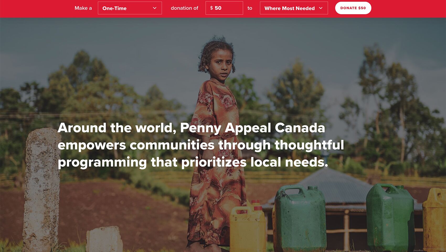
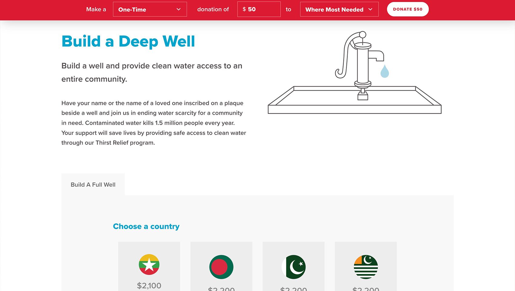
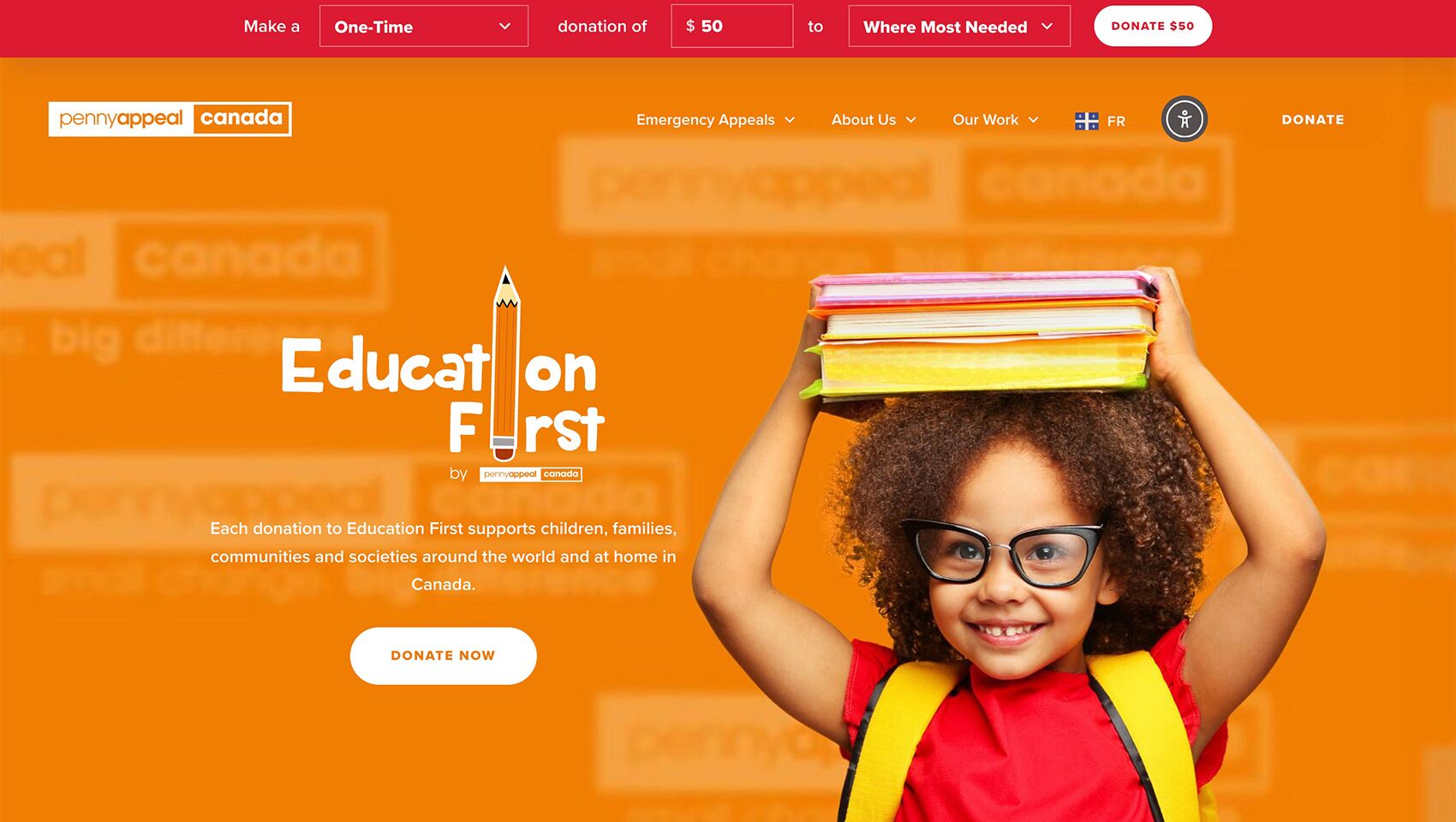
Penny Appeal Canada is a Muslim-led relief and development organization with a bold vision for a better world. Committed to breaking the cycles of poverty and need, they take a sustainable, long-term approach to creating thriving communities. Their mission is to transform small contributions into a BIG impact, providing essential aid such as clean water, education, orphan sponsorship programs and disaster relief worldwide.
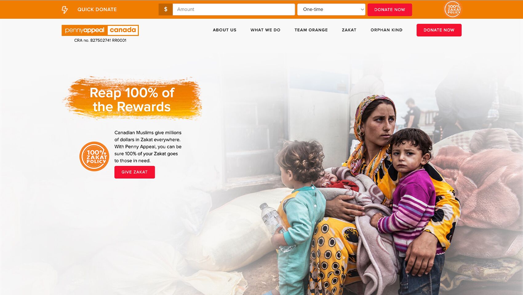
The original website struggled to create a credible and engaging donor experience. The staff and the marketing team were hesitant to direct potential donors to a platform that was difficult to navigate, unreliable, and uninspiring. A lack of a dedicated Ramadan page limited campaign visibility, while an inconsistent donation platform further undermined user trust. Without a design that reflected the brand’s identity, the site failed to support its primary goal of encouraging donations.
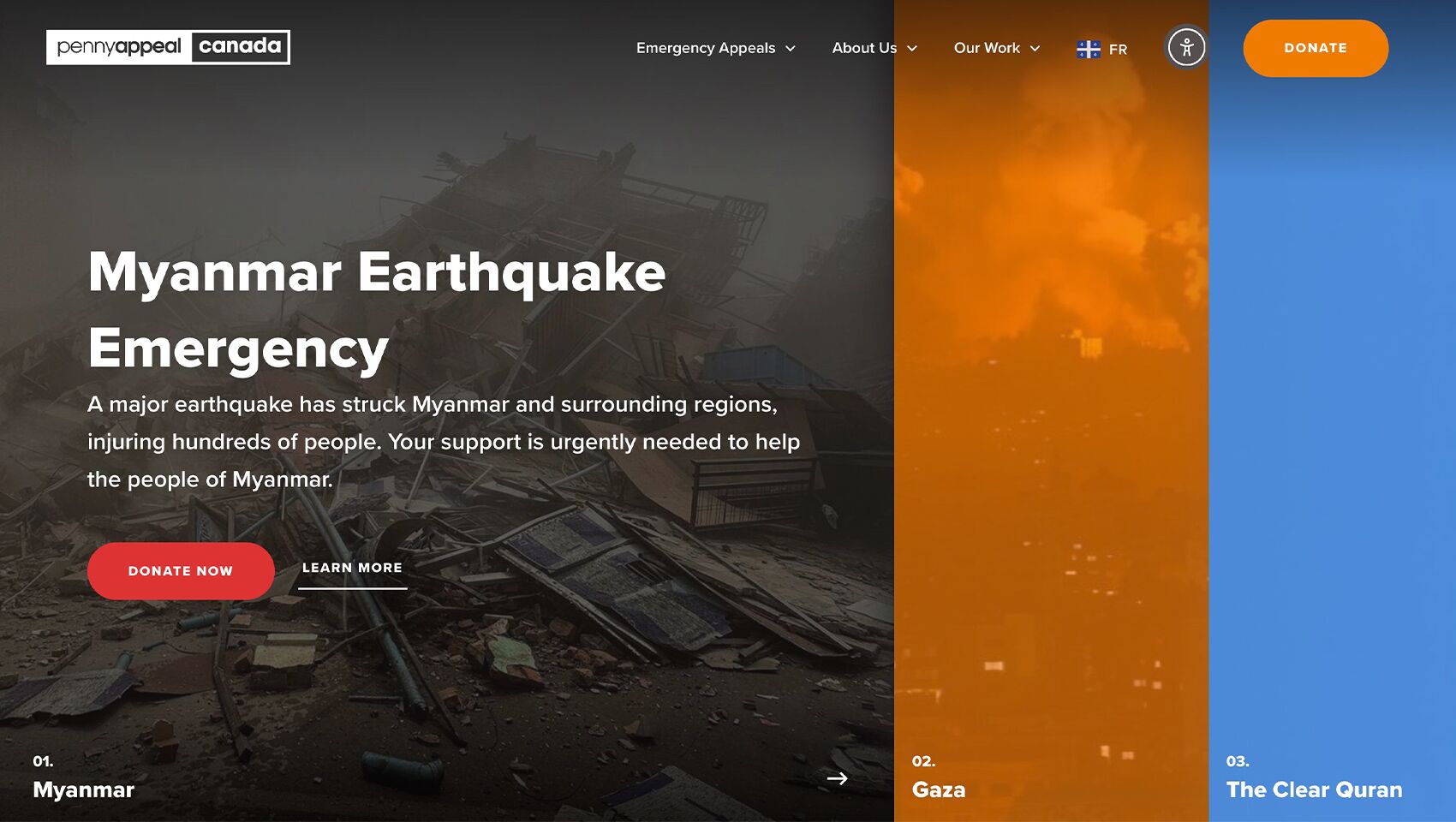
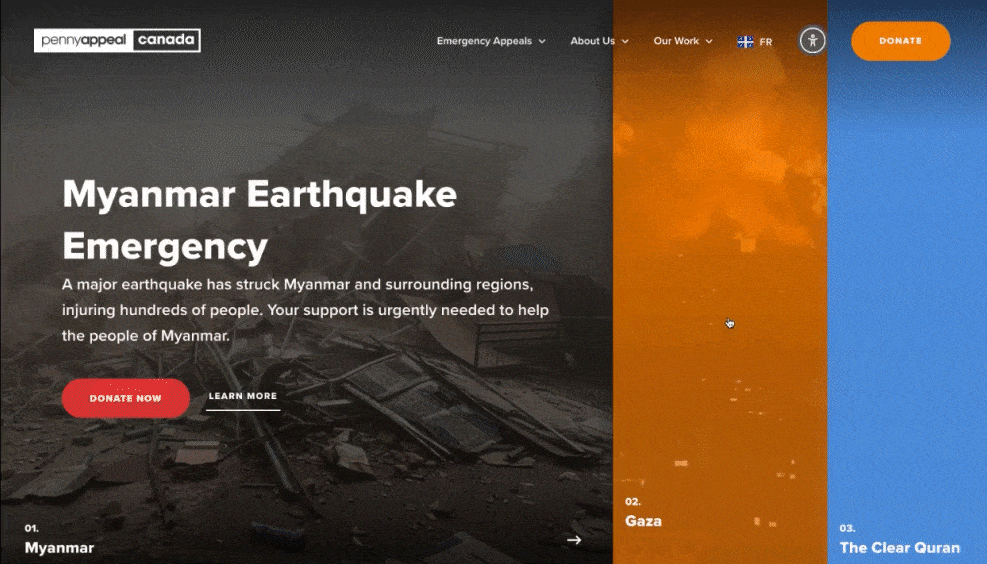
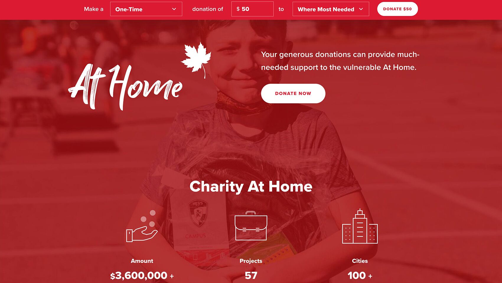
The initial redesign addressed major issues around trust and usability, giving the team confidence to direct donors to the site. However, we later recognized that the donation page was still buried within the main site, making it harder for users to give quickly and confidently. We transformed the site into a donation-first platform, introducing a dedicated Ramadan page and resolving navigation challenges. By streamlining the donor journey, we helped increase annual donations from ~$1 million to ~$15 million. The redesign prioritized returning donors while introducing new supporters to the organization’s mission, creating a platform that inspired confidence and maximized fundraising potential.
Before & After
The Client Says
Talha Ahmed
Penny Appeal Canada
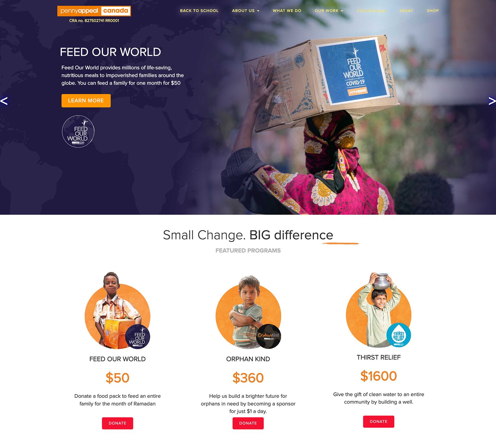
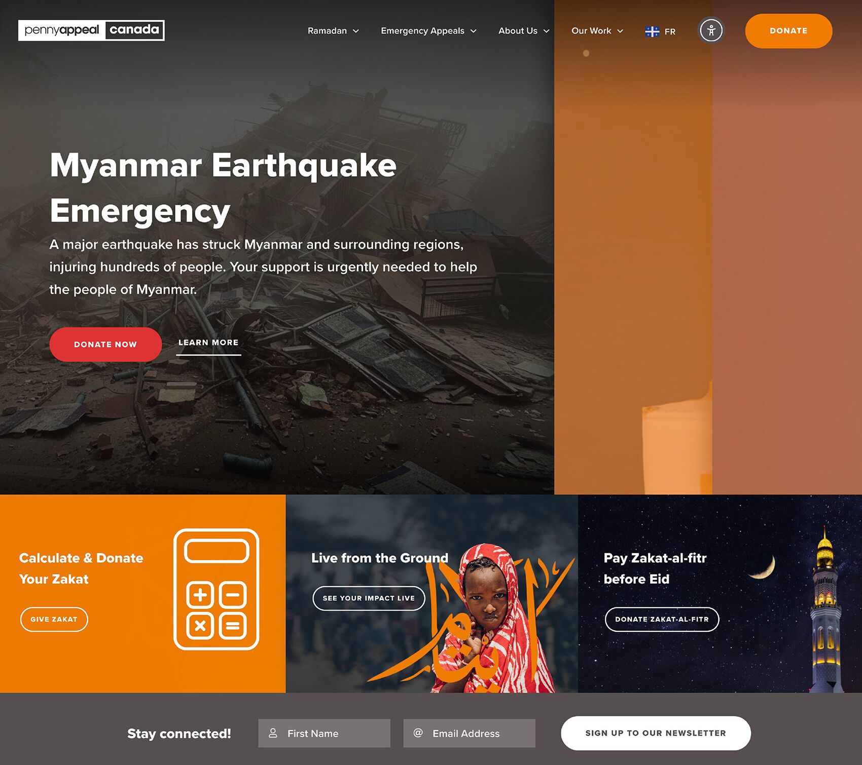
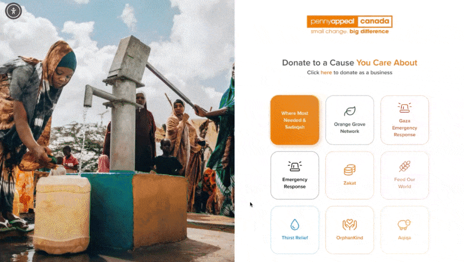
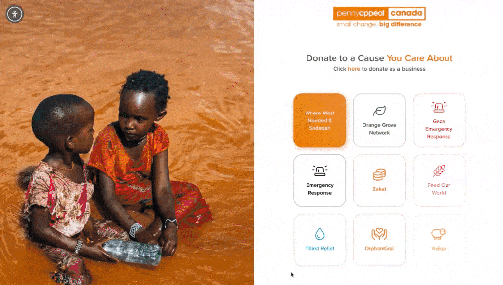
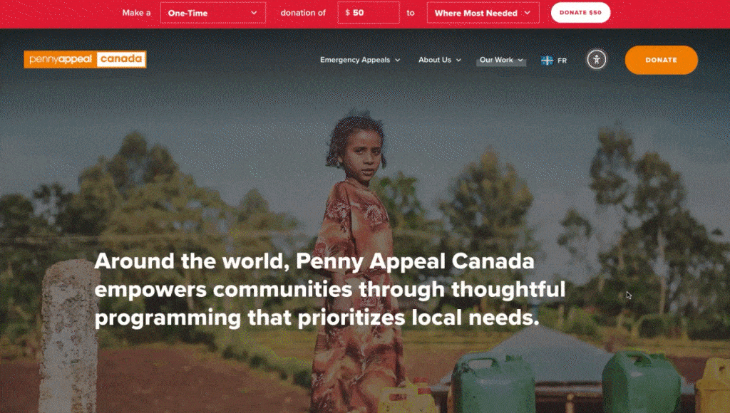
Main Site
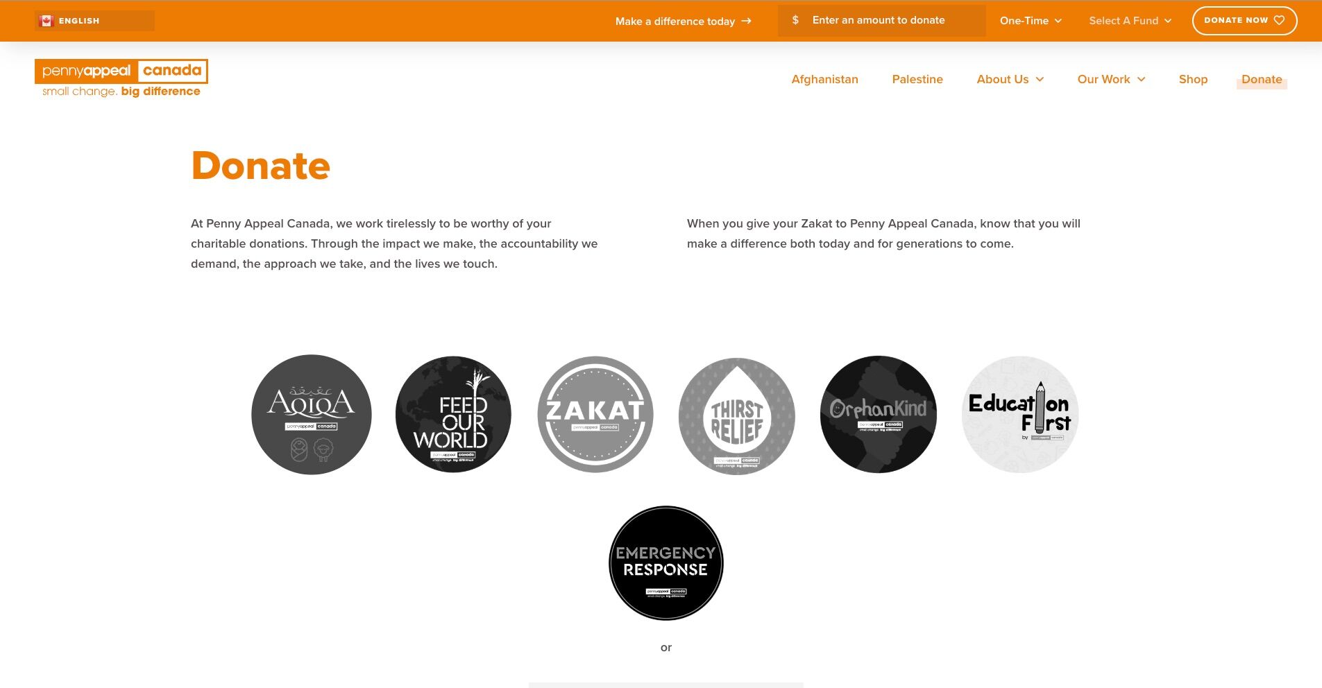
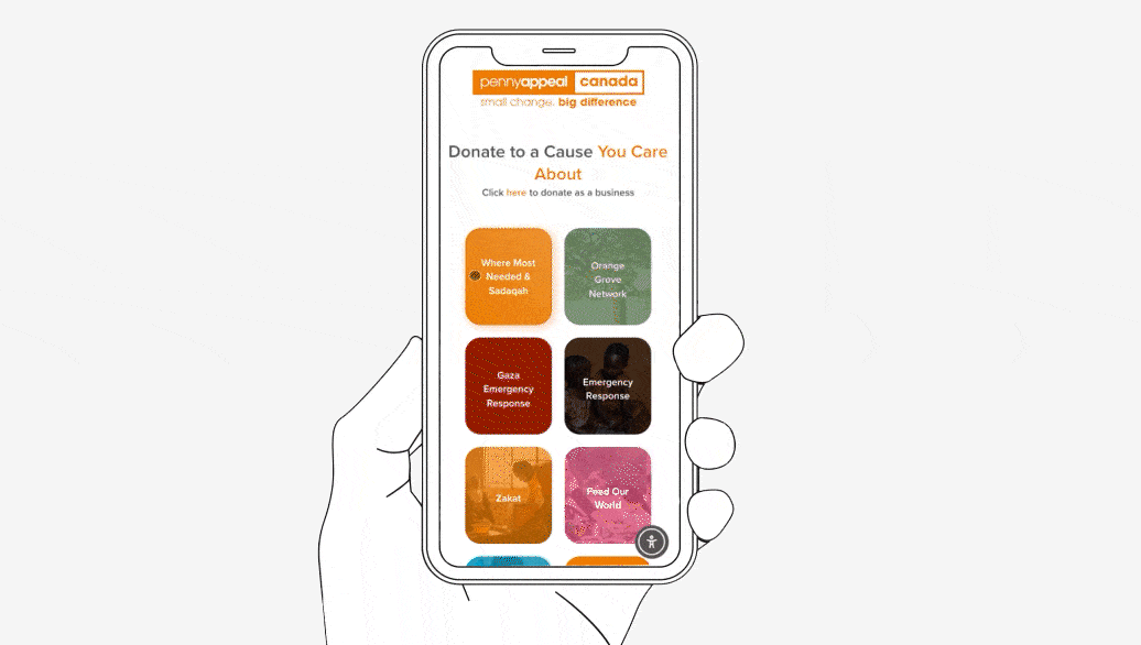
Donation Site
The ‘before’ version was our first iteration. After the first year, we transformed the donation page into its own platform. The 2021 donation page was functional, but it lacked focus. It was simply added onto the main site, resulting in extra steps and moments of hesitation. Many users bypassed the homepage entirely, landing on a page that wasn’t designed to stand alone—leading to potential drop-offs. Despite these challenges, the page still brought in ~$3.3 million, highlighting the need for a more focused and intentional design to enhance the user experience and drive even greater results.
Redesigned & Refined
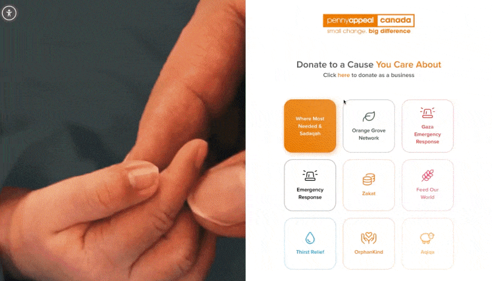
Lightening Fast Donation Platform For Returning Donors
Recognizing the opportunity for improvement, we shifted focus in the redesign to create a more intentional experience tailored to returning donors. The donation process was streamlined into three simple steps. Once users clicked ‘Donate,’ the main navigation was removed, creating a focused, distraction-free environment that honoured their time and purpose
To align with how most users interacted with the platform, the redesign prioritized mobile optimization—making key donation options immediately accessible for a quicker, smoother experience. This approach catered to the habits of returning donors while simplifying the process. The result? A significant increase in contributions—from ~$3.3 million to ~$8 million—demonstrating how thoughtful design can turn user intent into meaningful action.
By centering the experience around returning donors, the redesign delivered results that spoke for themselves. This focused approach led to a significant surge in engagement, bringing in tens of thousands in donations each day and ultimately reaching ~$8 million. The streamlined design also introduced multiple, intuitive ways to give, making the act of donating not just faster but also more accessible and impactful.
Integrating New Donors Into The User Journey
We didn’t overlook new donors. Instead, we designed the experience to give them space to explore the organization and its donation programs at their own pace. By recognizing that new donors needed time to familiarize themselves with the causes, we created a streamlined process for returning donors while providing a more flexible, self-paced journey for those new to the platform.
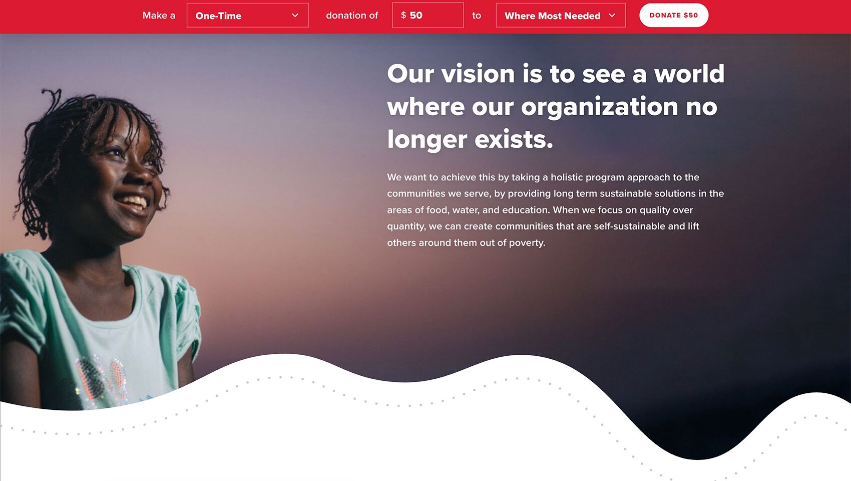
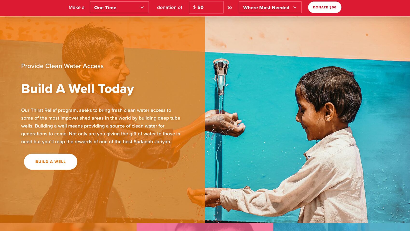
Elevated Brand Experience Through Design
Strong visuals and purposeful design made their message clear, giving the team newfound confidence in their website. They could proudly share it for the first time, knowing it truly represented their vision for global change.
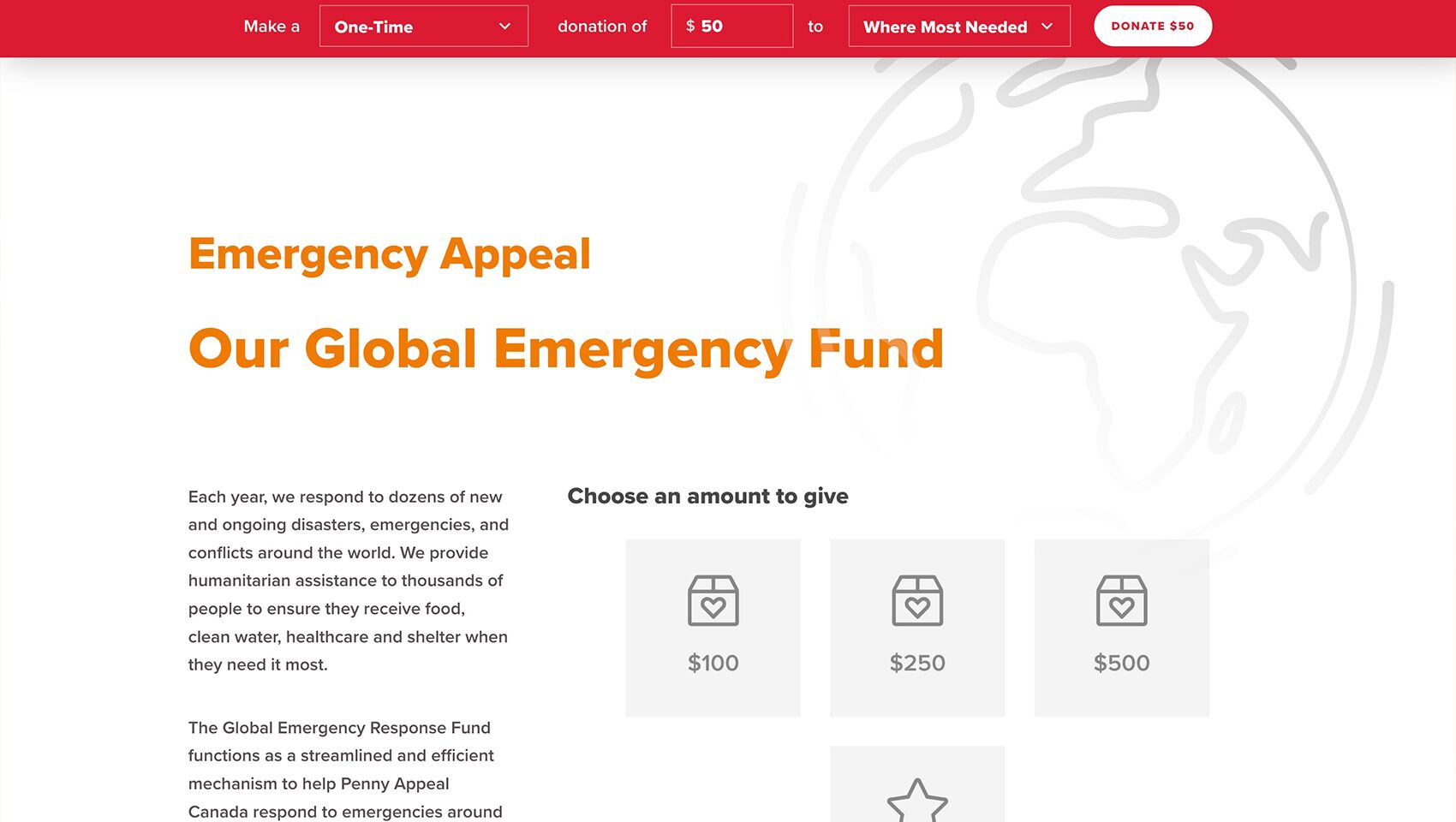
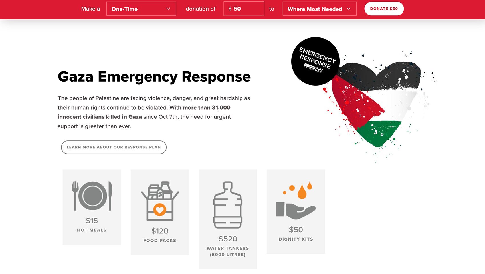
Evolution of the Ramadan Campaign
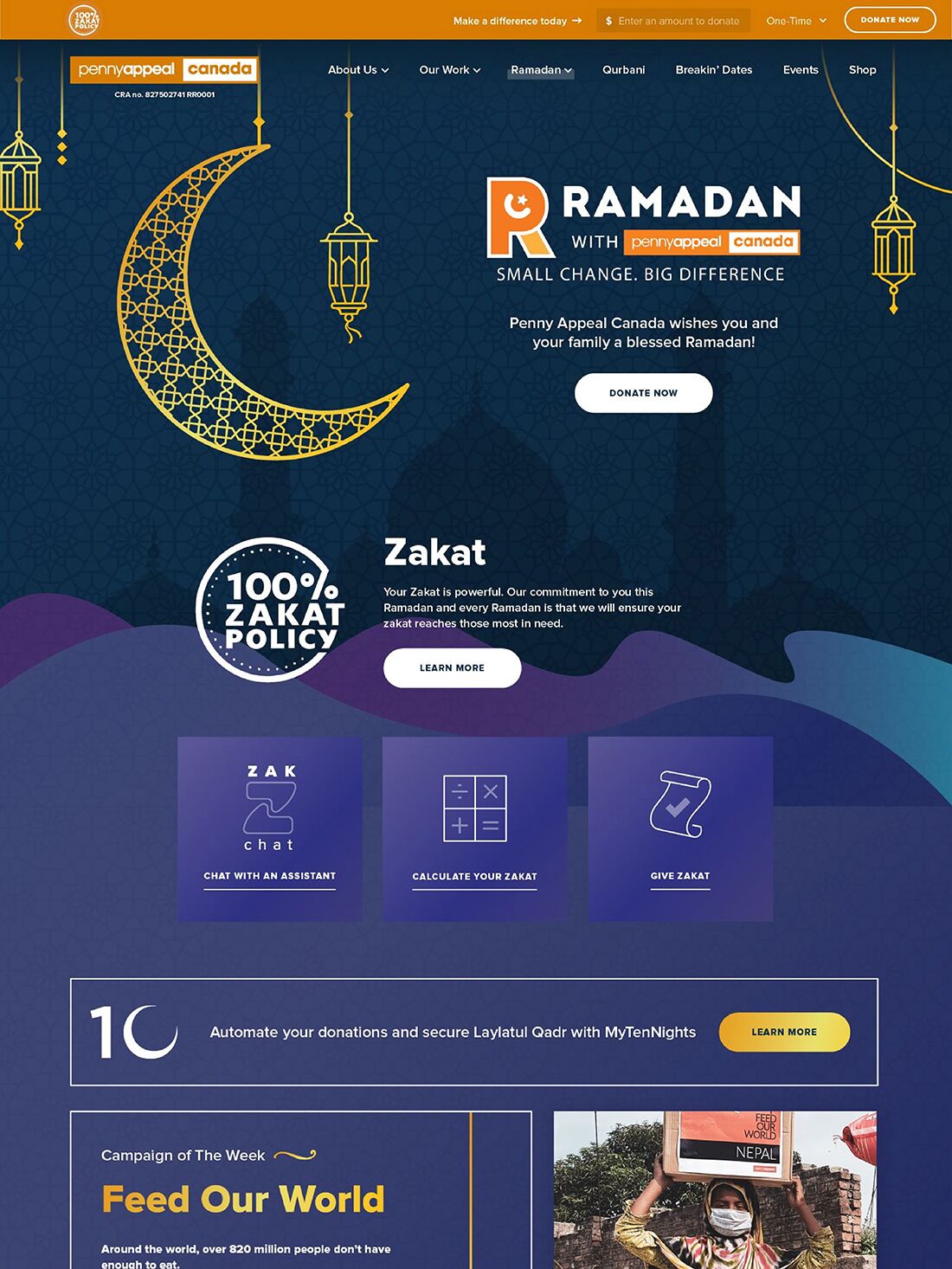
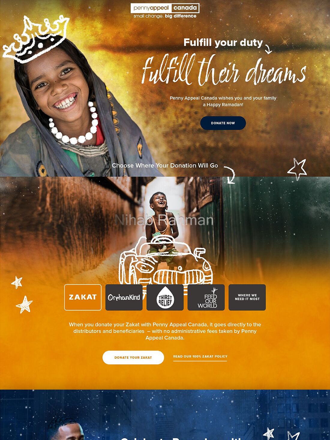
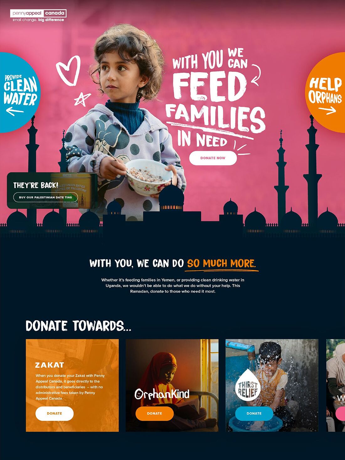
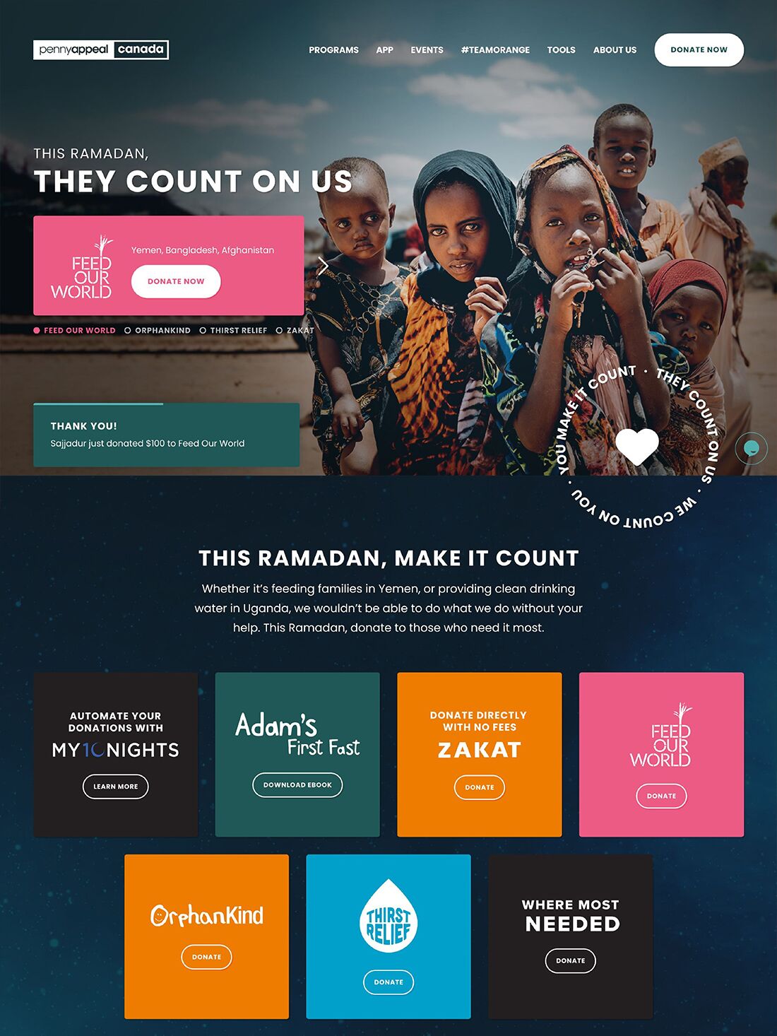
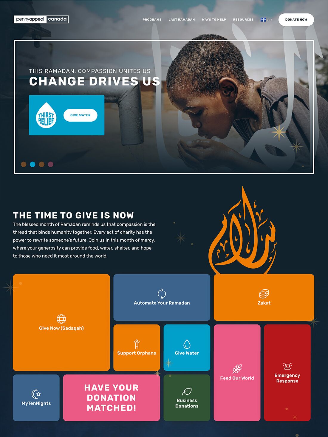
Previously, Ramadan was acknowledged with a simple banner and a generic message like “Ramadan Mubarak,” lacking campaign-specific design or storytelling. The evolution began after 2021, when we gave Ramadan its own dedicated spotlight, moving beyond a simple banner to a fully styled, campaign-focused page. We found that subtle animations could enhance engagement, while too many calls to action or an active navigation bar pulled focus. Each year after that, we refined the layout to guide users more intuitively through the page. The final version struck the right balance by simplifying the donation process, elevating the design, and creating an immersive, user-focused experience that supported the campaign’s goals.
Mobile First Design Across The Platform
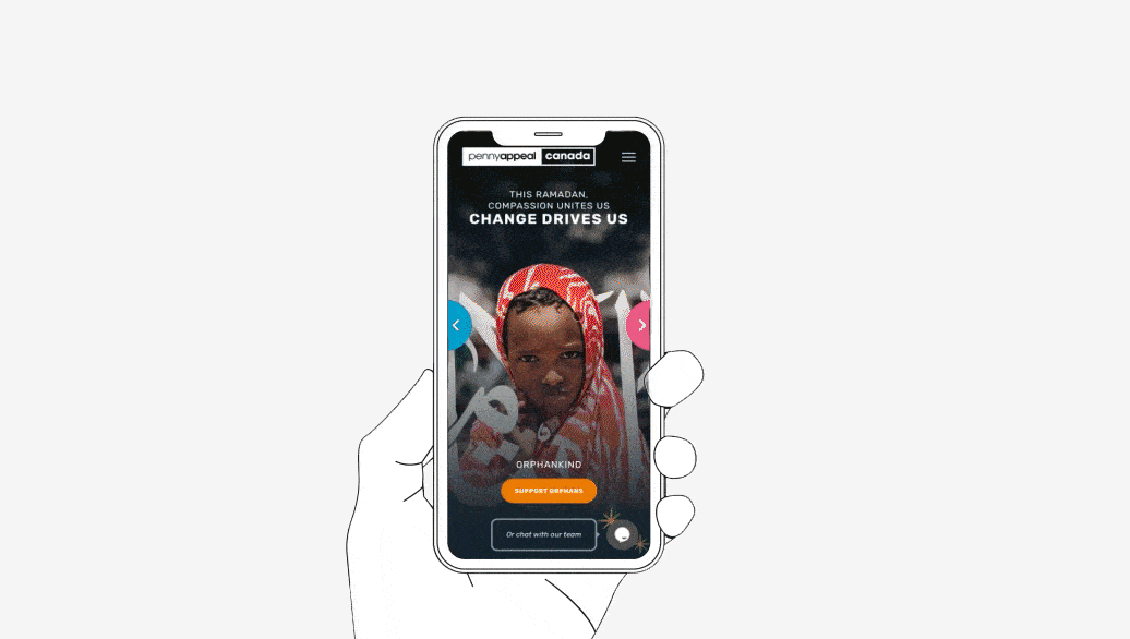
We moved away from horizontal scrolling to create a more straightforward and predictable layout. Prominent call-to-action elements were refined, allowing the design and content to build trust and guide users more naturally toward donating. The result was a cleaner, more engaging experience that felt intuitive, visually refined, and aligned with how users interact with the site.
Designing For Real Impact
Looking back, it’s clear that thoughtful design played a key role in shaping the donation experience. By offering various seamless ways to give, we helped users connect more directly with the causes they cared about. The result? Increased engagement and meaningful support across all charity programs — a reflection of how design can drive real-world impact.
Main Orange
#FF8700
rgb(255, 135, 0)
CMYK 0 47 100 0
Emergency Black
#231F20
rgb(35, 31, 32)
CMYK 0 11 9 86
Feed Our World PInk
#F05B89
rgb(240, 91, 137)
CMYK 0 62 43 6
Thirst Relief Blue
#00A5CE
rgb(0, 165, 206)
CMYK 100 20 0 19